Laura Jun | Lab 13a (April 20, 2026)
Pie Chart
In this data, I want to not only display how the carbon emissions are broken down by food category but illustrate, from an overview, the most common type of food that is generating this. Because I coded this in my file, I like how you can hover over the states to see exactly how much carbon dioxide
equivalent (CO2eq) each food category averages. Fresher produce (like apples or carrots) generate such a little amount in comparison, which is visually shown by the smaller slice of the pie and by the colors of the foods.
THINGS TO CHANGE IN THE FUTURE: I want to figure out how to change the colors of each slice to give a better visual understanding of the food (i.e. lower food slices being green and higher being red OR vegetables being green and dairy being white).
I also want to add a feature that when you hover over each bar, you can see the individual foods in that category (i.e. you see the individual contribution beef, chicken, or pork contribute when you are clicking on that slice.
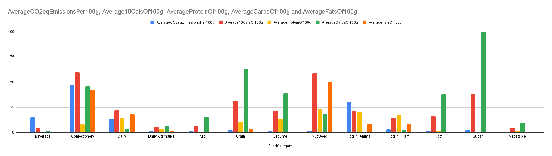
Bar Chart
In this data, I want to not only display how the carbon emissions are broken down by food category but illustrate, from an overview, the most common type of food that is generating this. Because I coded this in my file, I like how you can hover over the states to see exactly how much carbon dioxide
equivalent (CO2eq) each food category averages. Fresher produce (like apples or carrots) generate such a little amount in comparison, which is visually shown by the smaller slice of the pie and by the colors of the foods.
THINGS TO CHANGE IN THE FUTURE: This is not a very interesting chart and doesn't really show too much. If I were to continue this, I think adding a key that shows the relation between the nutrient breakdown of a food category and its carbon dioxide emissions
might be cool and a bit more interesting. Like, something I noticed was that foods higher in carbs in relation to calories tended to have lower CO2 emissions. Actually, if I am being fully transparent, calculating the nutrient breakdowns (carbs, protein, and fats) might
be better if I describe them in relation to % of calories they contribute since 10g of carbs have less calories than 10g of fat.
But IDEALLY, I would replace this chart and figure out how to create a heat map with this data to overlay on an image of the grocery store shelf instead.