Food CO2 Emissions
Bar Chart
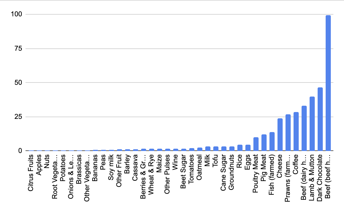
My thoughts on this Bar Chart
I think this data is great because it shows the drastic difference of carbon emissions in a really clear way. The thing I don't like about this is that, out of the three models I chose, I think this one is that it is the least descriptive - it doesn't show which food category (meat product, plant, etc.) the food falls in. So, I think this model would be best paired with other models to be more descriptive.
I think this data is great because it shows the drastic difference of carbon emissions in a really clear way. The thing I don't like about this is that, out of the three models I chose, I think this one is that it is the least descriptive - it doesn't show which food category (meat product, plant, etc.) the food falls in. So, I think this model would be best paired with other models to be more descriptive.
Pie Chart
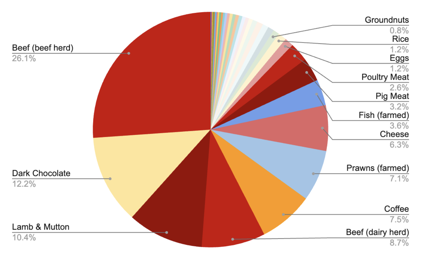
Key
Red: Animal Products
Yellow: Sweet Treats
Orange: Beverages
Blue: Seafood
Pale Colors: Produce
My thoughts on this Pie Chart
In this data, I want to not only display how the carbon emissions are broken down by individual food item (so that shoppers can see that beef creates a TON of carbon emissions but also to illustrate, from an overview, the most common type of food that is generating this. In this case, I created a key to quickly indicate that it is mainly the animal products that cause this problem. Fresher produce (like apples or carrots) generate such a little amount in comparison, which is visually shown by the smaller slice of the pie and by the colors of the foods.
Heat Map
Key
Red: Lots of CO2 Emissions
Yellow: Medium amount for CO2 Emissions
Green: Low CO2 Emissions
Note: the size of the heat map also indicates how impactful the food is
My thoughts on this Heat Map
I think this data is my favorite because it captures the comparative component the other charts have while also adding an additional color aspect. I will admit, unlike the pie chart, the colors don't indicate the food group, but I am sure that we accompany this form with the pie chart (if need be). I really wanted to mirror the actual grocery store so the heat map is shown on the products themselves. If you hover over each item, it will not only tell you more information about the CO2 emissions, but also tell you more about the food item. Hover over the carrots to see an example.
My favorite thing about this is the gamified version: people try to buy groceries that maximize their budget to hit their nutritional goal for the week while also trying to minimalize their CO2 emissions. I think this is a great educational tool that not only teaches people which foods to target to limit emissions, but also gives them hands-on experience with the material.
Data
This data was taken from "Greenhouse gas emissions per kilogram of food product" from Our World In Data. However, for our full data model, I am planning on potentially combining other data models to broaden our data set (nutritional information/cost/perishability of the foods we pick).
| Food | Greenhouse gas emissions per kilogram |
|---|---|
| Citrus Fruits | 0.39 kg |
| Apples | 0.43 kg |
| Nuts | 0.43 kg |
| Root Vegetables | 0.43 kg |
| Potatoes | 0.46 kg |
| Onions & Leeks | 0.50 kg |
| Brassicas | 0.51 kg |
| Other Vegetables | 0.53 kg |
| Bananas | 0.86 kg |
| Peas | 0.98 kg |
| Soy milk | 0.98 kg |
| Other Fruit | 1.05 kg |
| Barley | 1.18 kg |
| Cassava | 1.32 kg |
| Berries & Grapes | 1.53 kg |
| Wheat & Rye | 1.57 kg |
| Maize | 1.70 kg |
| Other Pulses | 1.79 kg |
| Wine | 1.79 kg |
| Beet Sugar | 1.81 kg |
| Tomatoes | 2.09 kg |
| Oatmeal | 2.48 kg |
| Milk | 3.15 kg |
| Tofu | 3.16 kg |
| Cane Sugar | 3.20 kg |
| Groundnuts | 3.23 kg |
| Rice | 4.45 kg |
| Eggs | 4.67 kg |
| Poultry Meat | 9.87 kg |
| Pig Meat | 12.31 kg |
| Fish (farmed) | 13.63 kg |
| Cheese | 23.88 kg |
| Prawns (farmed) | 26.87 kg |
| Coffee | 28.53 kg |
| Beef (dairy herd) | 33.30 kg |
| Lamb & Mutton | 39.72 kg |
| Dark Chocolate | 46.65 kg |
| Beef (beef herd) | 99.48 kg |
By Laura Jun